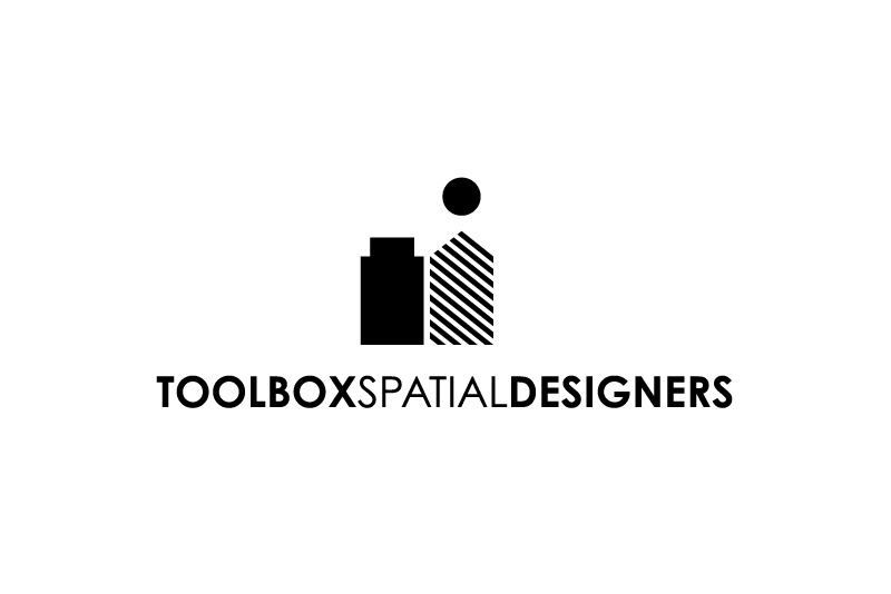
Toolbox Spatial Designers is an interior design company that specialises in the field of concept
development, with a distinct focus on decoration and constructions, providing solutions for individuals
and corporations. The chosen logo consists of two Lego® stones that represent their two areas
of expertise.
The Lego was chosen as a symbol of transformation and mobility.
The Lego with the stripes stands for their decorations while the concrete Lego represents constructions.
The dot was used to signify the dominance of the initial idea for every successful project of Toolbox.
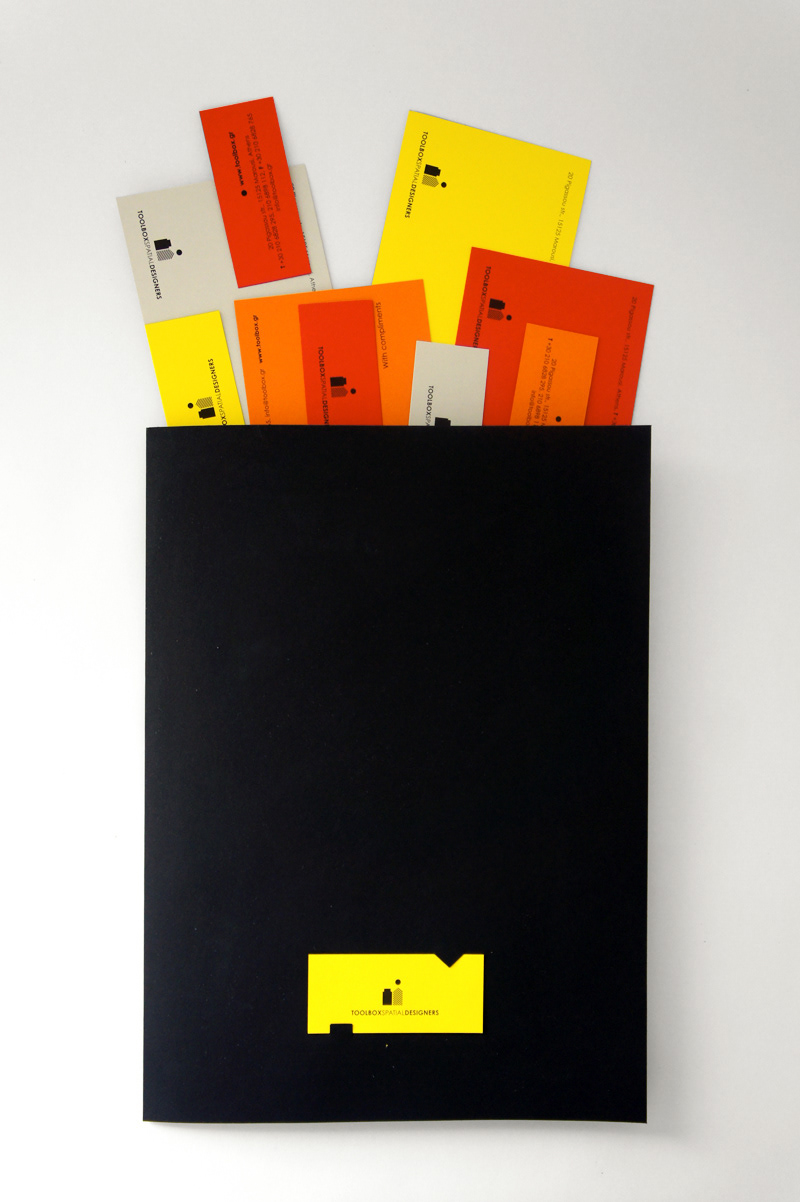
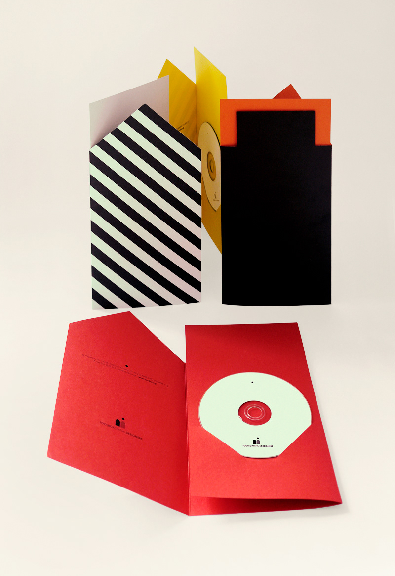
For the colour palette we chose a variety of coloured paper for the implementation of the identity,
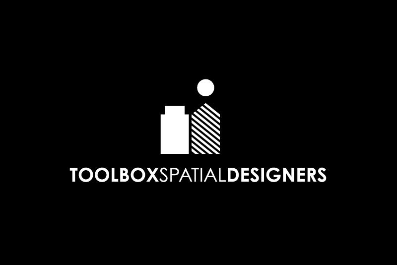
in order to separate the materials used for each sector. The logo is always applied in black & white
enhancing the brand and creating a consistent yet colourful identity.
Agency: SomeThink Creative Group